Adopture · Brand and website design
How do you make restraint read as confidence?
Adopture sells the thing most companies get wrong: not buying AI, but getting people to actually use it. I designed and built its brand system and nine-page website, and wrote the strategic copy.
The category looks identical from the outside: a gradient hero, three feature cards, and a posed stock team pointing at a monitor. The brief underneath the brief was to build something that didn’t look like that, and to make the restraint read as confidence rather than absence.
- Timeline
- July–August 2026
- Scope
- Brand system, nine-page website, copy
- Build
- Hand-built static pages
- AI tools
- Claude and ChatGPT
Structure
Promise before pain
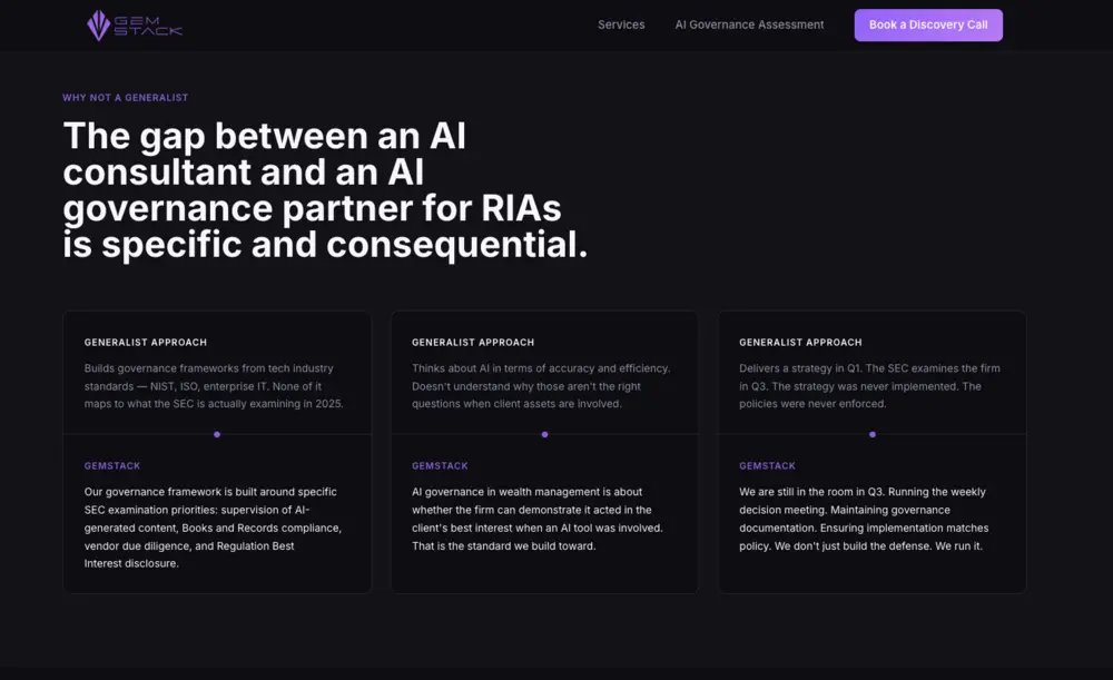
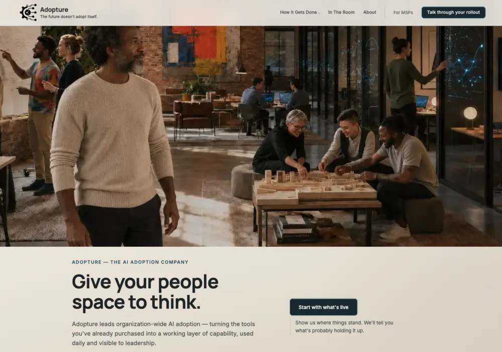
The structural argument came before the visual one. Discovery showed that Adopture’s site led with compliance risk, like most sites in this space. I opened on the promise and let the problem follow: the gap between a tool being approved and the work actually changing. That ordering drove the architecture of every page, and it’s why the homepage leads with space to think rather than with risk.
The load-bearing decision
Entry points, not a staircase
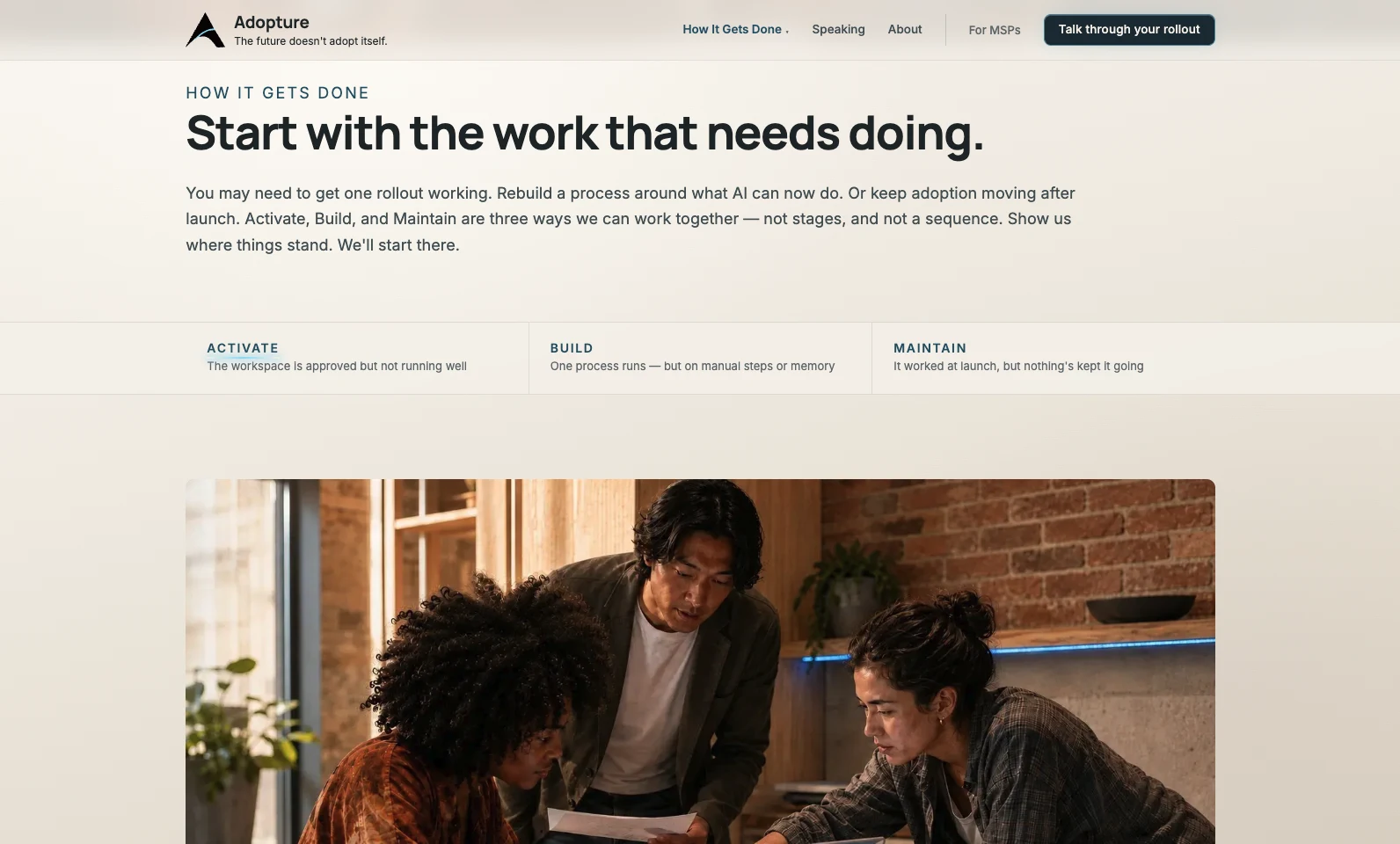
The core framework, Activate, Build, Maintain, carried a trap I designed against from the first wireframe. Presented as three steps, it reads as a staircase: a mandatory sequence that tells most prospects they’re starting at the bottom. Presented as three entry points, it meets organizations where they already are.
A sequence tells most prospects they’re starting at the bottom.
Three equal doors meet organizations where they already are.
That constraint shaped the copy, the page order, the card layout, and eventually the social templates. It’s the single decision I’d point to as load-bearing.
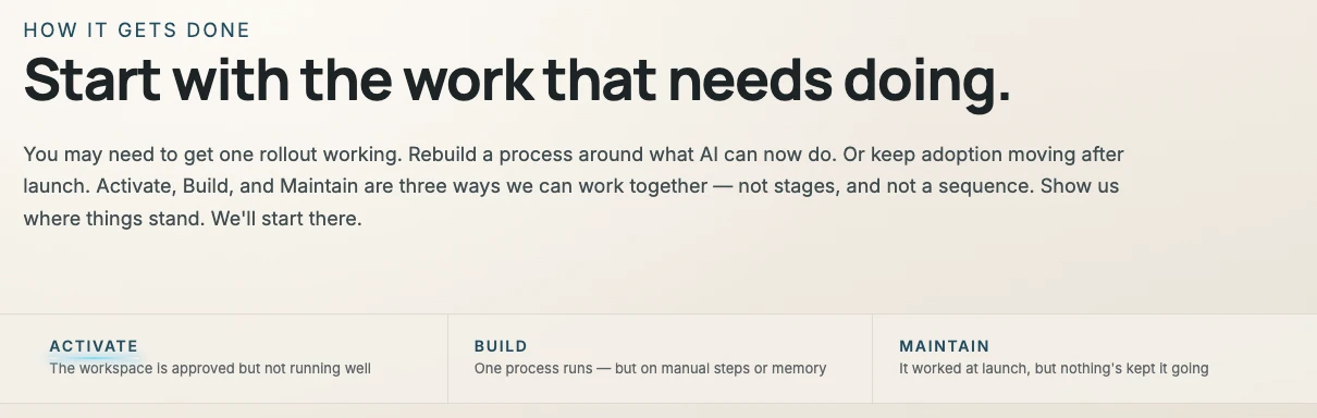
- The copy names the decision outright: three ways to work together, “not stages, and not a sequence.”
- Each entry point is labeled by a situation a prospect recognizes, such as “The workspace is approved but not running well,” rather than by a step number.
View full screen
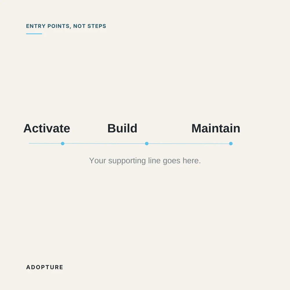
The template’s own label carries the decision: entry points, not steps.
Visual system
Restraint as a system, not a mood
On a brand selling calm capability, a site that performs sophistication undercuts the argument it’s making. So I treated restraint as rules I could hold myself to.
A palette with one color in it
- Warm white
#F5F1EB - Charcoal
#20282B - Glass blue
#8DDCF7 - Trust blue
#24566B
Warm neutrals rather than the cool grays the category defaults to, closer to paper than to a dashboard. Against them sits exactly one chroma, with a deeper blue for type that has to hold weight. No secondary accent, no success green, no alert orange. When a palette has one color, that color means something every time it appears.
Two typefaces, three jobs
Eyebrow · Manrope 700, uppercase
Give your people space to think.
Body copy is set in Inter 400, so long passages stay quiet and easy to read.
Manrope 800 for headlines, Manrope 700 in wide-tracked uppercase for eyebrows, Inter 400 for body. No serif, no monospace, no third face. The eyebrow does most of the structural work: it labels each section in a quiet voice so the headline underneath never has to explain itself.
The current, drawn rather than decorated
The brand’s one expressive device is a current of blue light, the signal of something working. It’s a stroke, not a glow: a path whose gradient fades to zero opacity at both ends, doubled with a blurred copy underneath at half opacity. It reads as light running through something rather than a graphic applied on top. Because it fades at both ends, it never terminates; it passes through the frame. I rationed it to roughly three deliberate moments per page, and cut effects that read as designed rather than felt, including several I liked.
Glass as the material

Where the brand needs to show intelligence at work, it shows it on glass: translucent panels with diagrams drawn in the same blue line, sitting in real rooms with real light behind them. The technology appears in the photography without a product screenshot. Adopture doesn’t sell software, and the imagery shouldn’t imply it does.
Proportion decided, not defaulted

The In The Room hero runs at 16:9.4 rather than the default 16:9, a slightly deeper band sized to hold the whole room. Section ratios vary deliberately across the site rather than repeating one safe rectangle. The sticky navigation sits at 88% opacity with a light backdrop blur, present enough to orient and transparent enough that the page reads as continuous underneath.
Imagery
A generated world with fixed rules
Every photograph on the site was AI-generated, deliberately, under a fixed set of world rules. The client’s own observation made the clearest case for it: the imagery demonstrates the thing Adopture sells, done well.
World rules
- No regional signaling
- Elevated business casual
- A recurring cast with movie-logic continuity, so the same people reappear across the site
Representation as design criteria
- Distribute people across frames rather than clustering them
- Break the pattern where tattoos only appear on feminine-presenting figures
- Keep an older woman in the cast through every regeneration


The same people reappear across the site with movie-logic continuity: A leads the homepage hero, and A and B return in the room.
Social
One system across every format
I carried the same rules into templates for square posts, Instagram portrait posts, and YouTube Shorts: warm neutrals, one blue current, glass as the material, the quiet eyebrow, and the recurring cast.
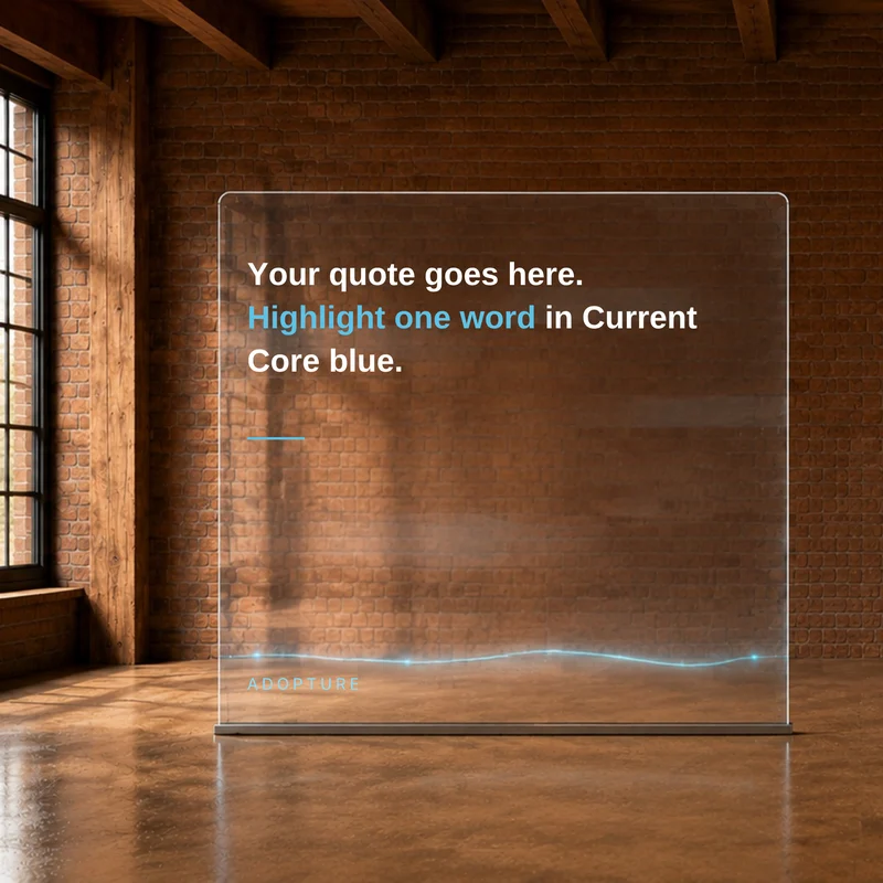
SquareQuote on glass 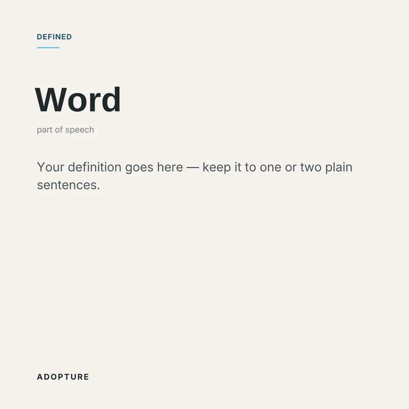
SquareDefined 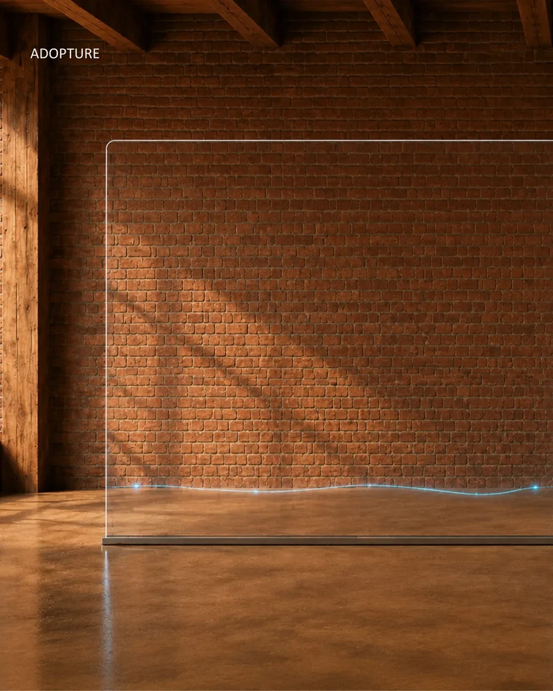
Instagram 4:5The current 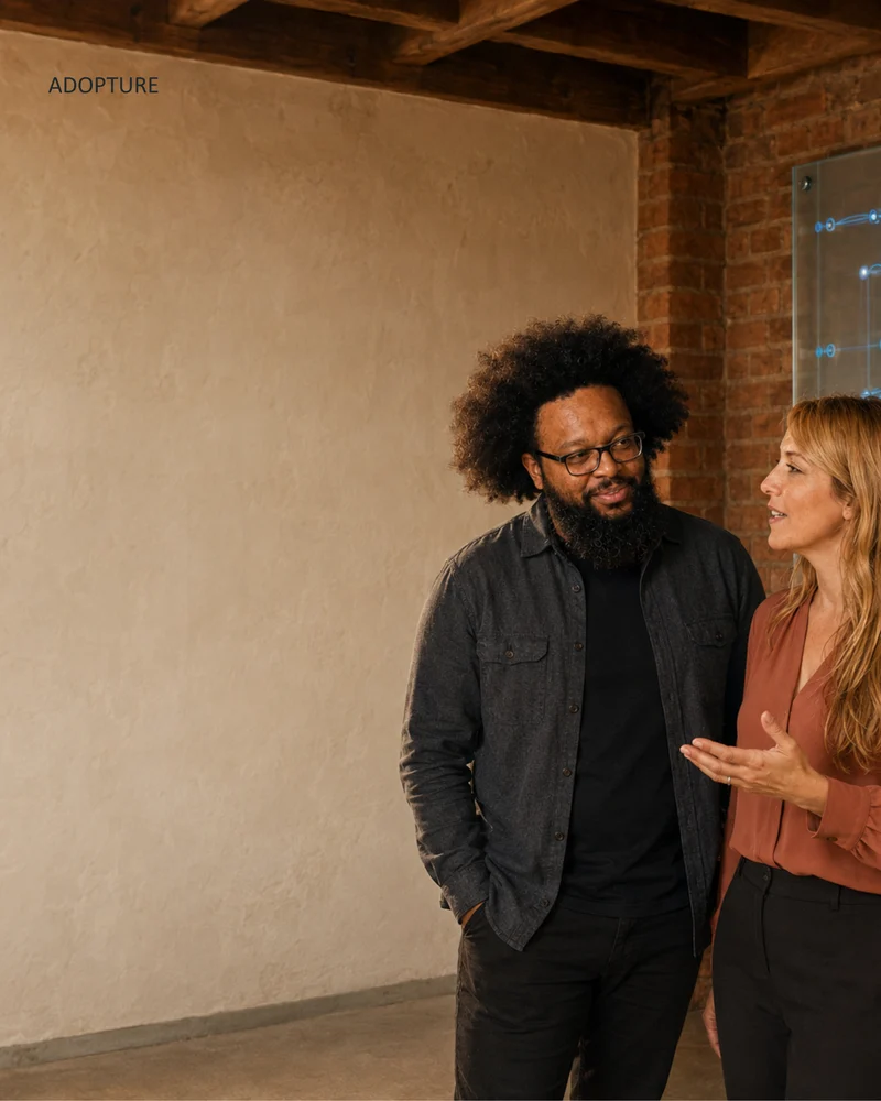
Instagram 4:5The cast 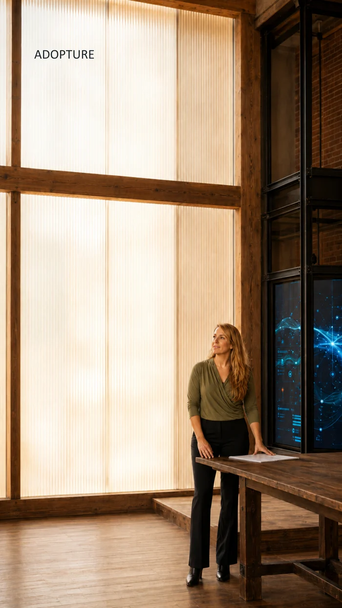
Shorts 9:16Room to speak
Craft
Precise where it counts
Motion, placed precisely

Adopture
The wordmark ignites letter by letter: each character arrives glowing in glass blue and settles into charcoal. The tagline follows, and its last phrase, “adopt itself,” stays lit in glass blue. It’s the most expressive moment in the system and lasts under two seconds. Everywhere else, heroes stay static and movement lives lower on the page, where it rewards scrolling rather than demanding attention on arrival.
Measure before fixing
I worked page by page rather than in sweeps, and verified the rendered output with computed measurements rather than by eye. That discipline repeatedly overturned my own diagnoses: container widths, nav alignment, and a hero I was certain about and was wrong about.
The mistakes that cost the most are the ones you’re sure you didn’t make.
Performance as part of restraint
I compressed every image at JPEG quality 85, an 84% reduction across the site, and checked face crops at 2x zoom before accepting it. Restraint in the design system is worth very little if the pages take four seconds to paint.
Outcome
Built for its own replacement
I took Adopture’s website from concept to launch in 2026, with the brand system, nine pages, and strategic copy. The site shipped as hand-built static pages, structured so the client’s CTO can convert it to React and a CMS without reverse-engineering anyone’s decisions.
Read my field notes: The Exhale